tl;dr: We make a confusion matrix (or ML metric) in python for a k-means algorithm and it's good lookin' :)
Posted: 2017-02-12
Step 1 The AML Workflow
Our story starts with an Azure Machine Learning experiment or what I like to call data science workflow (I'll use the word workflow here). We could also have started with a file (see Step 2 Second Way) instead, but either way, cleansed data gets fed into a k-means clustering algorithm after some initial processing (I like this brief post on k-means and it's got python snippets as well!). This post is about coding up one of the metrics that tells us how well an algorithm did if we have some "groundtruth" data to which to compare (remember that often we won't in unsupervised learning, but we are lucky today).
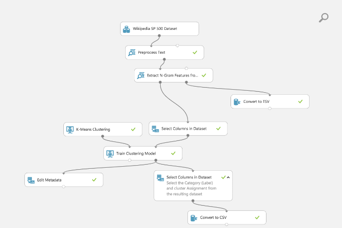
This workflow is for text feature extraction, selection and clustering based on extracted features as n-grams (check out the intro here for a quick explanation of this workflow and n-grams). I have one workflow with an a priori value for the centroids of 10 for the k-means algorithm. Here's a screenshot of the workflow (starting dataset is a listing of 500 Wikipedia articles, cleaned up, along with some category labels for "groundtruth" comparisons later - remember, k-means is unsupervised).
This workflow is already ready for you to use for free (using a Microsoft ID like outlook.com, xbox, hotmail, etc. accounts.) Find it in Cortana Intelligence Gallery (love this place for all of its abundance of resources):
Just to highlight, in the AML workflow I selected my desired columns for the confusion matrix with Select Columns in Dataset module to get 'Category' and 'Assignment' (cluster assignment as an integer from 0 to number of centroids I specified at the beginning).
Step 2 First Way
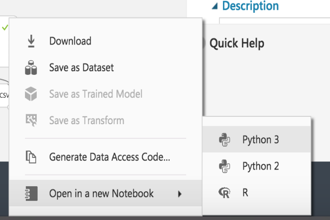
- Notice, I added a
Convert to CSVmodule (as you can see in above workflow diagram) after theSelect Columns in Dataset. - I right clicked on the output node of the
Convert to CSVand a little menu popped up from which I selected "Open in a new Notebook" and "Python 3" (because Python 3 rules of course - my R colleagues are going to really chide me now).
This opened up a jupyter notebook with the following code snippet:
from azureml import Workspace
ws = Workspace()
experiment = ws.experiments['<your experiment id shows up here>']
ds = experiment.get_intermediate_dataset(
    node_id='<your node id shows up here>',
    port_name='Results dataset',
    data_type_id='GenericCSV'
)
frame = ds.to_dataframe()
And imported my final dataset as a pandas DataFrame.
To get a confusion matrix I used pandas.crosstab and matplotlib.
I created a cell and used pandas's crosstab to aggregate the Categories by Assignments and place into a matrix.
# Creating our confusion matrix data
cm = pd.crosstab(frame['Category'], frame['Assignments'])
print(cm)
So we went from
Category    Assignments
0   Information Technology  0
1   Information Technology  9
2   Consumer Discretionary  0
3   Energy  4
4   Consumer Discretionary  0
5   Information Technology  2
6   Information Technology  0
7   Consumer Discretionary  0
8   Information Technology  3
9   Information Technology  2
10  Financials  8
11  Consumer Staples    0
12  Information Technology  6
13  Consumer Discretionary  7
14  Information Technology  2
15  Information Technology  2
16  Information Technology  0
17  Industrials 6
18  Consumer Staples    9
19  Health Care 9

...
to
Assignments                   0  1   2  3   4  5   6   7   8   9
Category
Consumer Discretionary       43  0   3  1   0  0   1  20   4   4
Consumer Staples             14  0   0  0   9  0   2   4   0   6
Energy                        2  1   0  1  12  0  28   0   0   0
Financials                   16  0   3  3   0  0   3   8  42   3
Health Care                   3  0   0  1   1  0   0   0   0  47

...
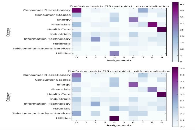
And finally, I used matplotlib and a modified example from the python docs, with this code,
# Plot our confusion matrix
# Code based on:  http://scikit-learn.org/stable/auto_examples/model_selection/plot_confusion_matrix.html

def plot_confusion_matrix(cm, title='Confusion matrix', cmap=plt.cm.BuPu, normalize=False):
    # Set figure size before anything else
    colcnt = len(cm.columns)
    rowcnt = len(cm.index)

    # Adjust the size of the plot area ()
    plt.figure(figsize=(colcnt/0.8, rowcnt/0.8))

    if normalize:
        # Normalize each row by the row sum
        sum_row = [a[0] for a in cm.sum(axis=1)[:, np.newaxis]]
        df_cm = pd.DataFrame(cm)
        df_sum = pd.DataFrame(sum_row)
        df = df_cm.as_matrix() / df_sum.as_matrix()
        cm = pd.DataFrame(df, index=cm.index, columns=cm.columns)

    # Show the plot
    plt.imshow(cm, interpolation='nearest', cmap=cmap)

    # Give the plot a title and colorbar legend
    plt.title(title, size=12)
    plt.colorbar()

    # All thes stuff for the tick mark labels
    xtick_marks = np.arange(len(cm.columns))
    ytick_marks = np.arange(len(cm.index))
    plt.xticks(xtick_marks, cm.columns, size=12)
    plt.yticks(ytick_marks, cm.index, size=12)

    # Just the regular xlabel and ylabel for plot
    plt.ylabel(cm.index.name, size=12)
    plt.xlabel(cm.columns.name, size=12)

    # Setting to offset the labels with some space so they show up
    plt.subplots_adjust(left = 0.5, bottom=0.5)


# Plot the confusion matrix DataFrame

plot_confusion_matrix(cm, normalize=False,
                      title='Confusion matrix (%d centroids):  no normalization' % len(cm.columns))

plot_confusion_matrix(cm, normalize=True,
                      title='Confusion matrix (%d centroids):  with normalization' % len(cm.columns))
to create the following awesome plots (a non-normalized and normalized confusion matrix):
Step 2 Second Way
I could have exported the AML Studio data as a file from the Convert to CSV module and downloaded the dataset after running. I would then upload the dataset to a notebook (as is also shown in the sample notebook here) and use the csv file with a 'Category' column and 'Assigments' column like is found here. It imports the data as a pandas dataframe.
The code snippet would have been:
# Dataset living on my github account exported from Azure ML
url = 'https://raw.githubusercontent.com/michhar/michhar.github.io/gh-pages-source/data/ngrams_and_clustering_result_dataset.csv'

# Importing the csv data with pandas
frame = pd.read_csv(url)
Thanks for reading, check out the sample (static) jupyter notebook here and best of luck with those confusion matrices!